Rathbones
Back to the future
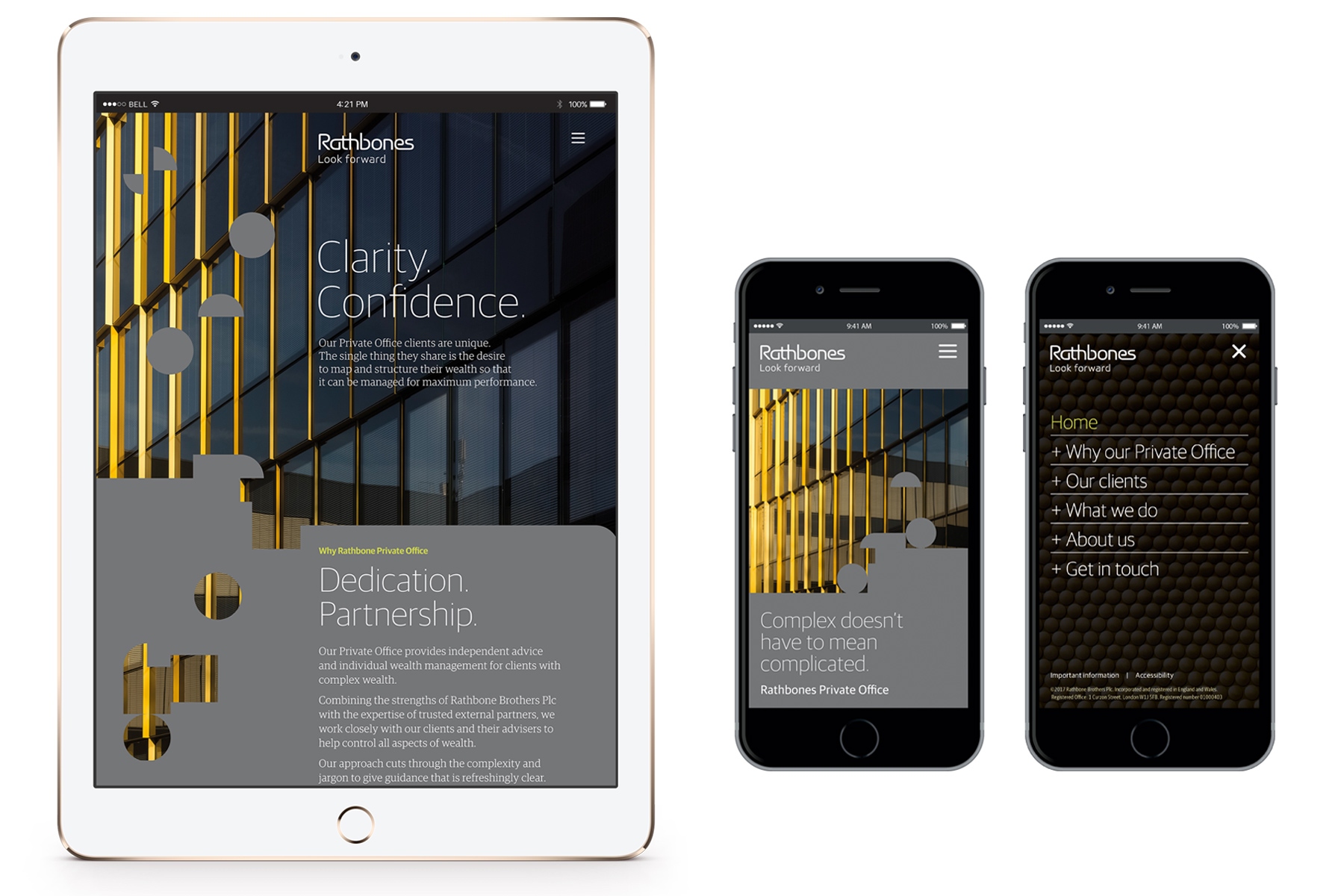
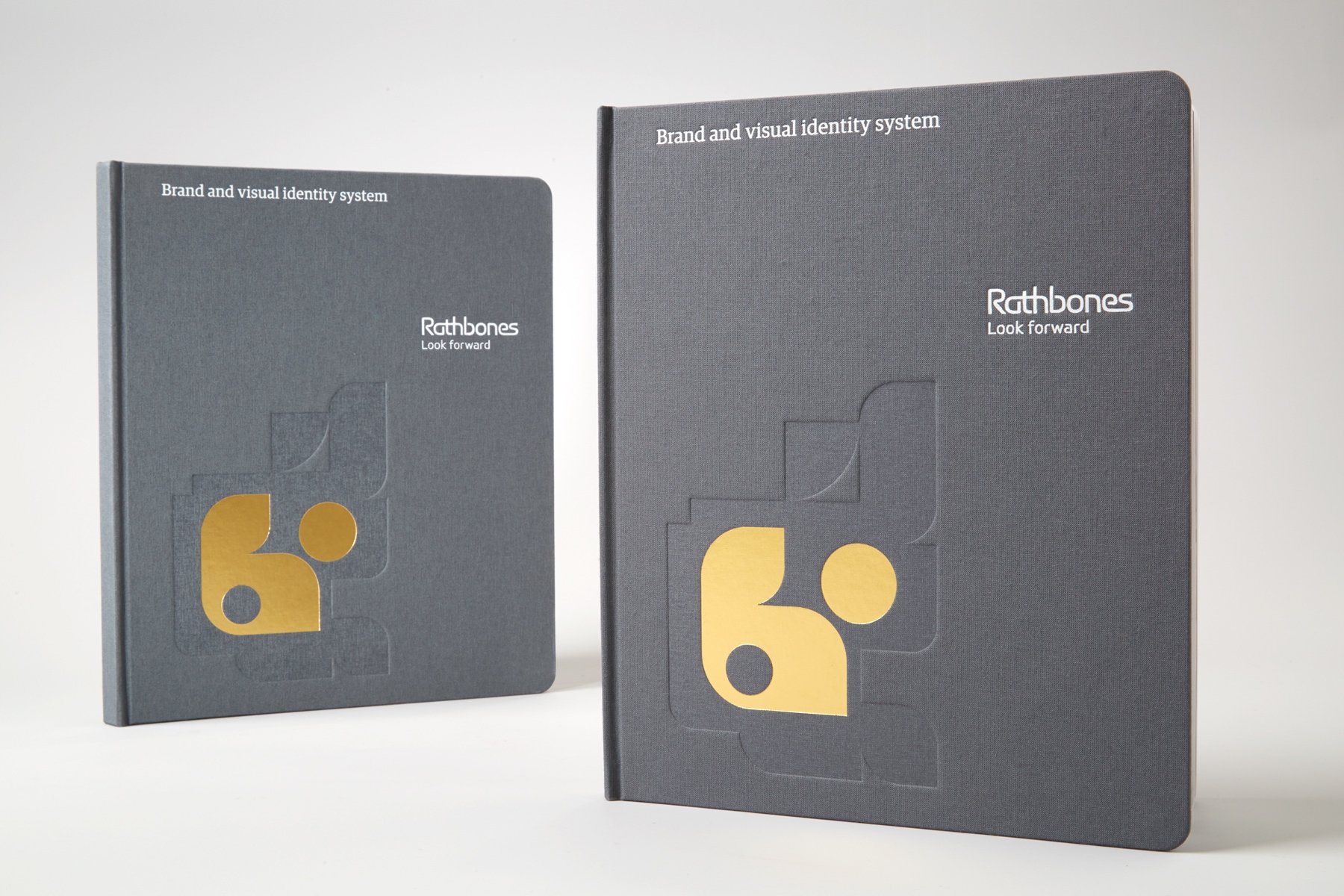
Our new visual identity for UK investment manager Rathbones suggests continuity, adaptability and modernity.
History needs to be handled with care in branding. Rathbones is rightly proud of its heritage: it’s been in business since 1742.
Longevity and experience can be powerful messages where money is concerned, but too much emphasis on the past can be a turn-off, especially for younger generations. We suggested a change of direction.
A new tagline expresses why all kinds of people invest with Rathbones. They’re not looking in the rear-view mirror. They are all thinking about the future.
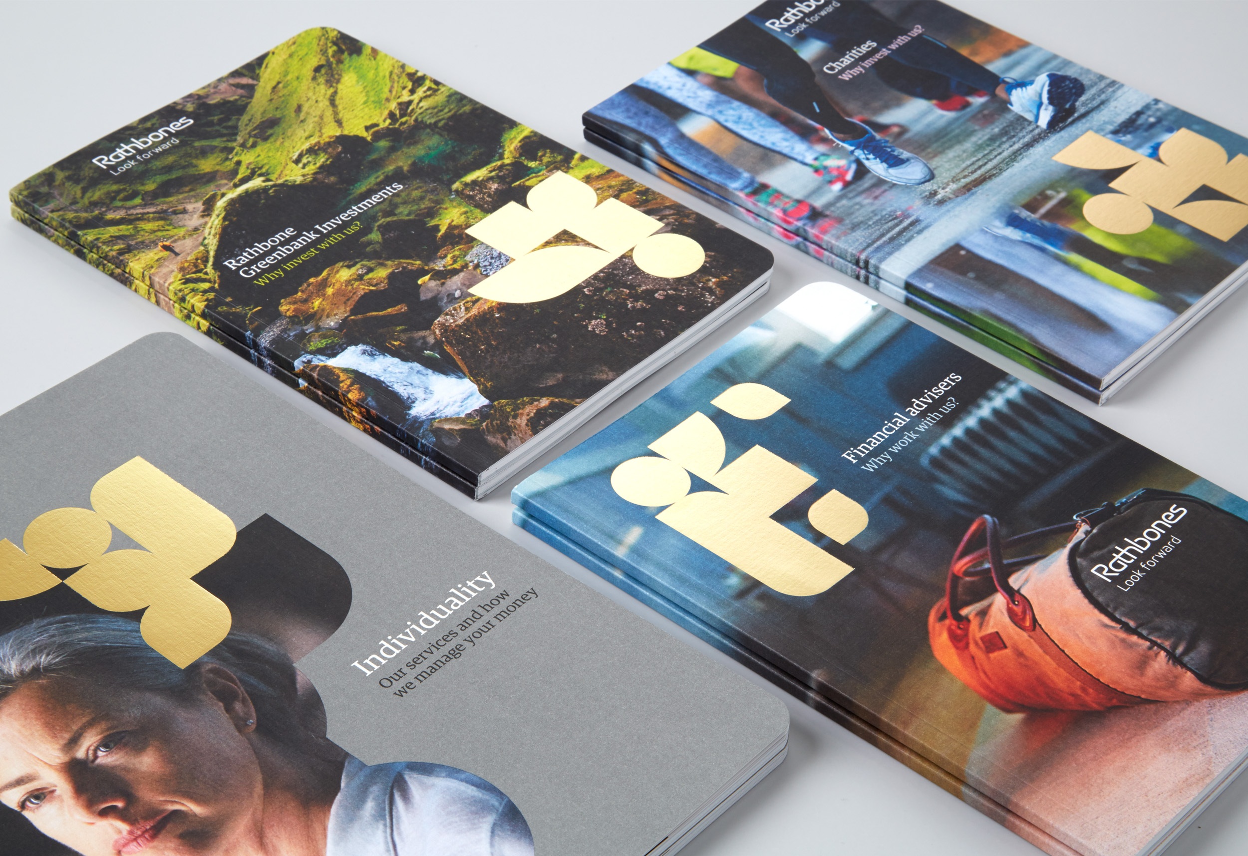
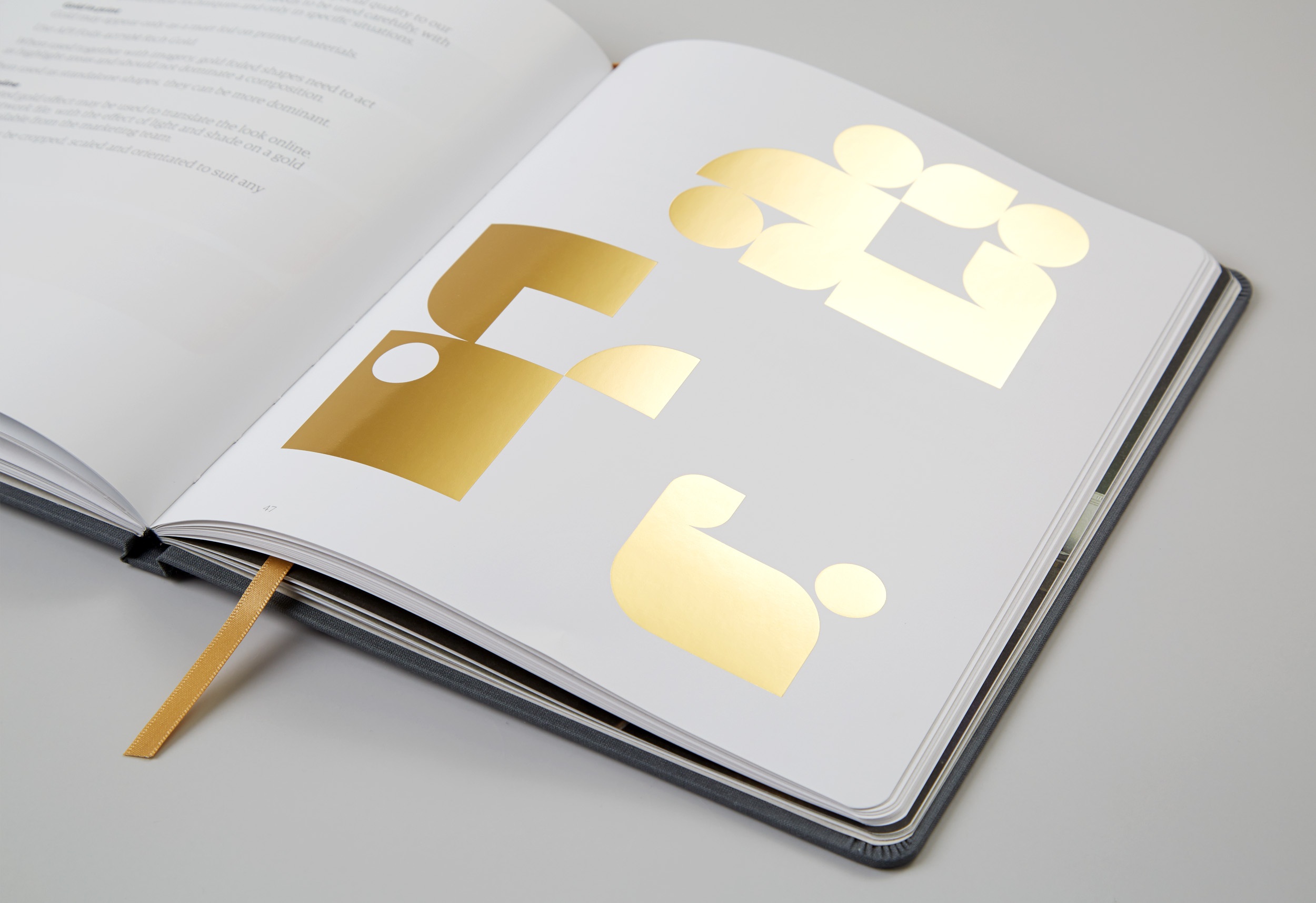
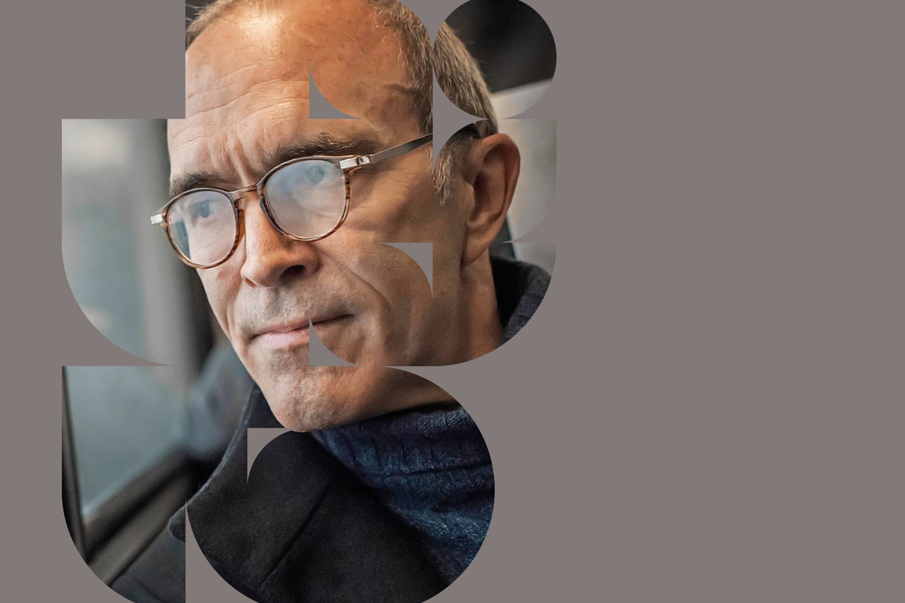
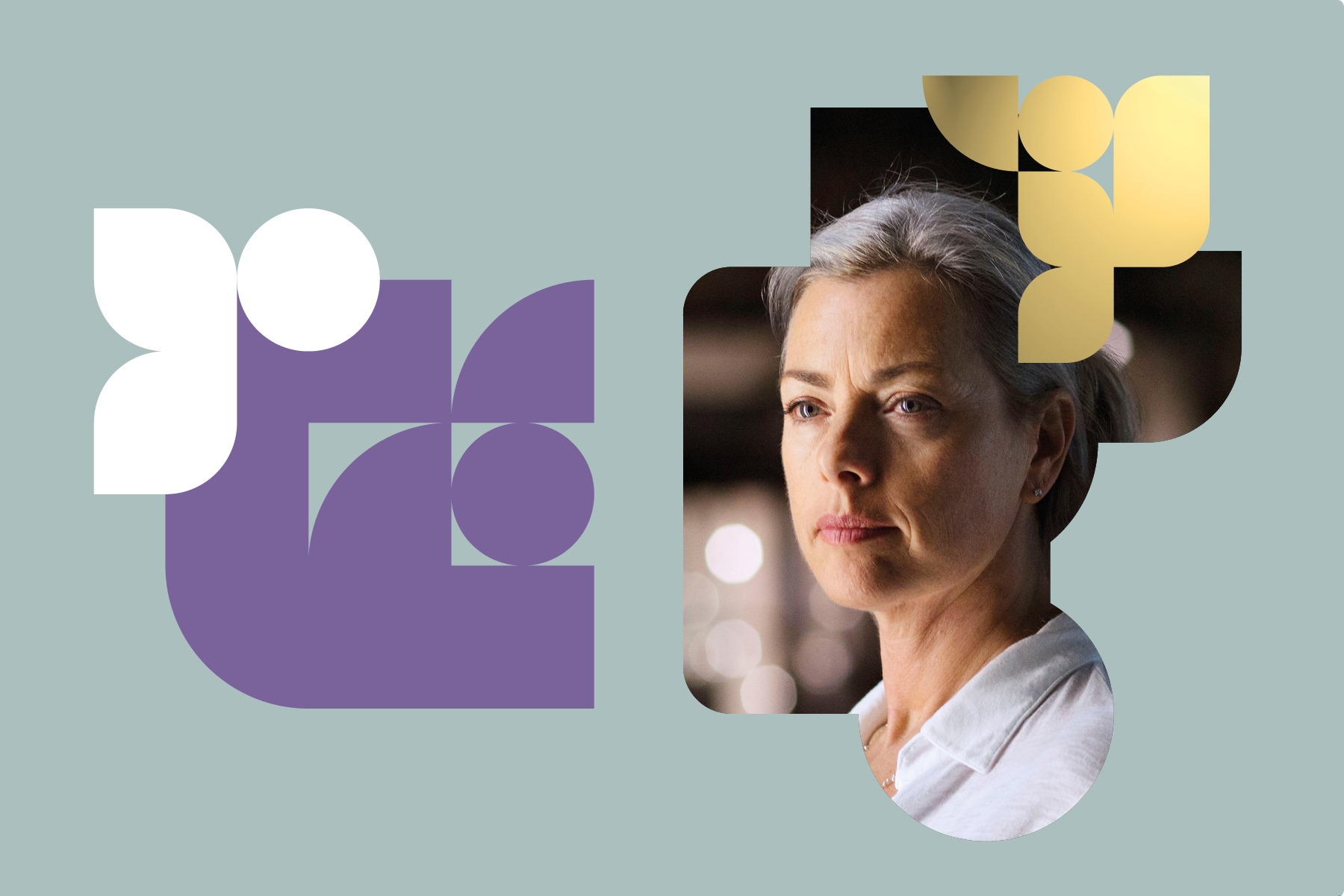
Imagery emphasises the individuality at the heart of the Rathbones approach to investment management.


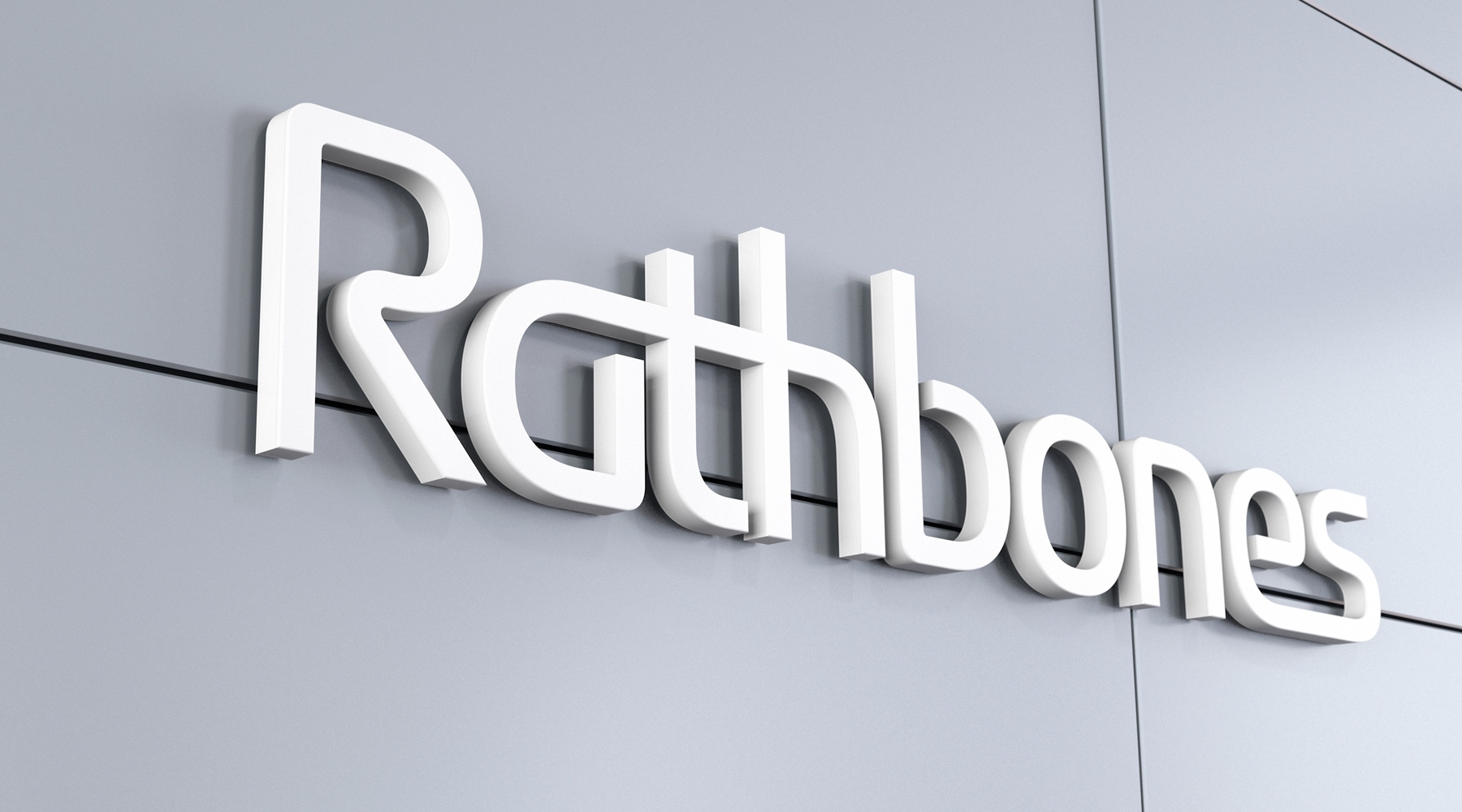
Heritage is still part of the Rathbones brand. Only now it has much more to say and this business looks like it belongs in the twenty-first century.