

Minimalism goes mainstream
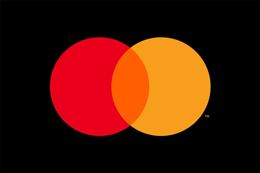
Brands brave enough to drop their name from their logo: Apple, Deutsche Bank, Mercedes, Nike, Shell… and Mastercard? We didn’t see that coming. There are few brands that can be recognised by their symbol alone. This decision shows that Mastercard wants to be seen as a premium brand.
When is it right to go without?
Mastercard says its decision to go all-in on logo-led branding was driven by a desire to maximise the space available in digital environments.
We’re big fans of minimal, understated branding that combines design purity with assertive attitude. Not everyone can pull it off. It requires a certain presence, and the nerve to see it through too. Credit to Mastercard for doing its homework. The payments platform says the move is based on 20 months of market research that indicated it has the brand recognition to support this strategy.

Freedom and future ready
We’ve long been aware of the advantages of the name drop. We advised Deutsche Bank to trust awareness of its iconic logo and lose the type when we redesigned its brand and visual identity back in 2009. That’s provided more freedom in design. It’s also made the brand more digitally compatible. We may see other brands following Mastercard by adapting brand strategy to a consumer market driven by digital interactions.
This can take time
We know from experience some of the challenges ahead for a global brand like Mastercard. Do you drop the name from all applications? Logo recognition is rarely consistent around the world, so it may be wise to move at different speeds and achieve global alignment over time rather than enacting new policy overnight. This is where an intelligent and flexible visual identity system can really prove its worth.
Who’s next?
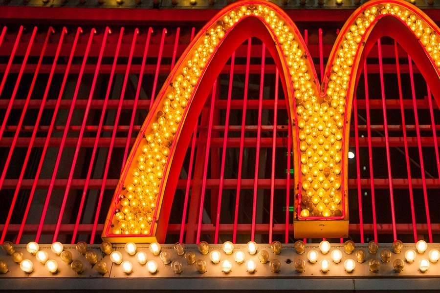
Might we see McDonald’s represent itself solely through its Golden Arches in the future? For now, let’s salute Mastercard for its courage and wish it well as it joins the small club of those who have the confidence to go without words.