
Even best-in-class UX is not the whole show
A great user experience comes from digital design, visual and verbal identity and what the brand stands for all working together.
Startup branding demands digital fluency
What makes a successful startup? A brilliant idea for a product or service is a great place to begin but as a startup failure rate of 90% demonstrates, it takes much more than this to build a business that gets off the ground.
We’ve written elsewhere about the importance of brand for startups. For the growing number of startups that are technology-led or technology-dependent, the brand experience is increasingly digital. This puts the discipline of user experience (UX) in the spotlight.
Effortless UX is not enough
UX is crucial to brand appeal for just about any business that’s mobile or online, so it’s no surprise to see startups putting so much effort into getting it right. A perfectly honed UX that works effortlessly is a beautiful thing. But the paradox of UX is that when it does what it should, it goes unnoticed.
UX needs other brand elements around it to give the user a true brand experience. Because it’s the personality and vibe of the brand that attract users and keep them coming back for more: what you say and show matter too.
Klarna gets the balance right
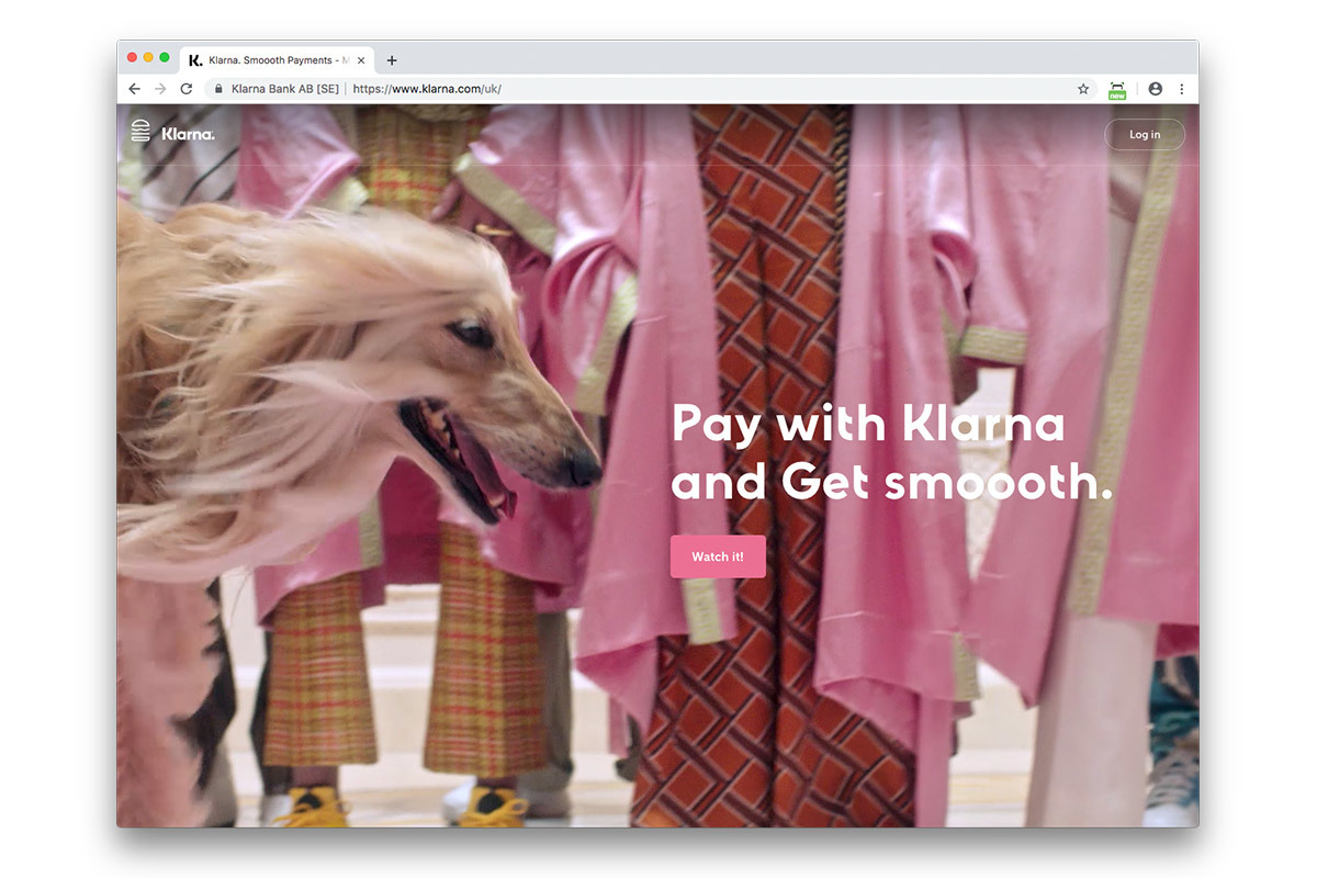
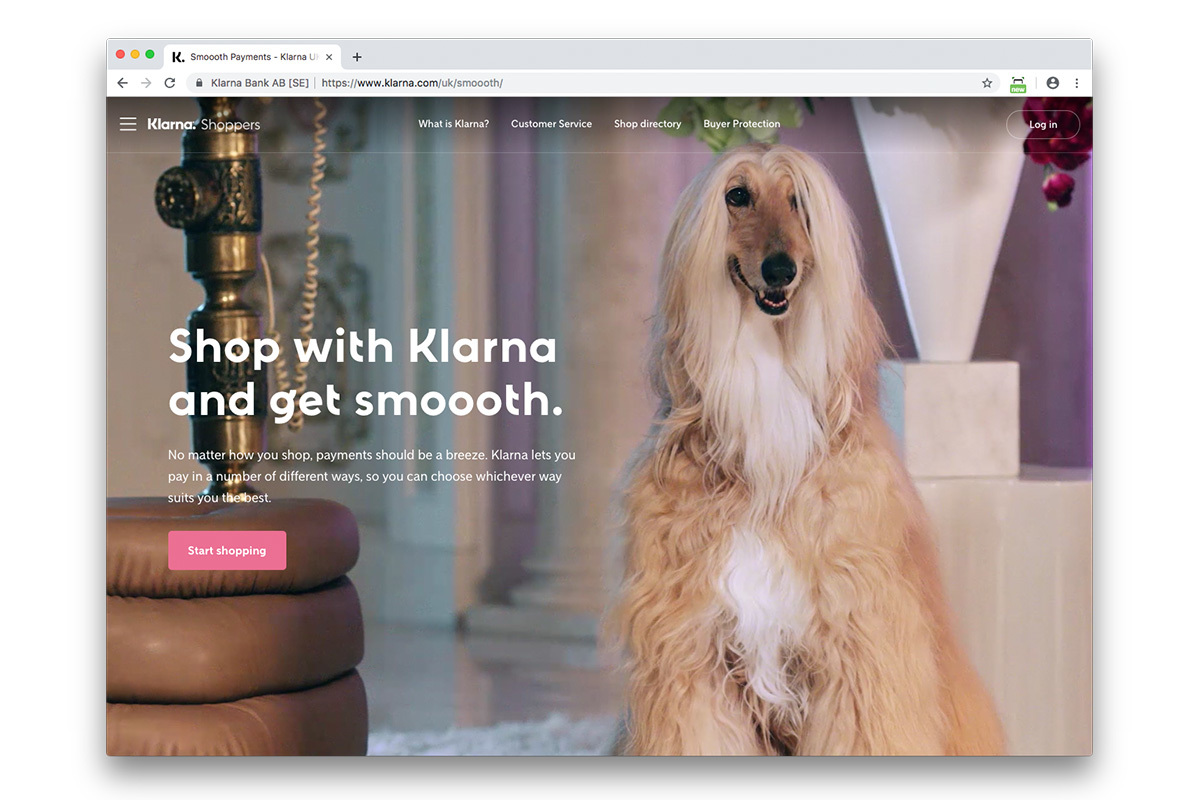
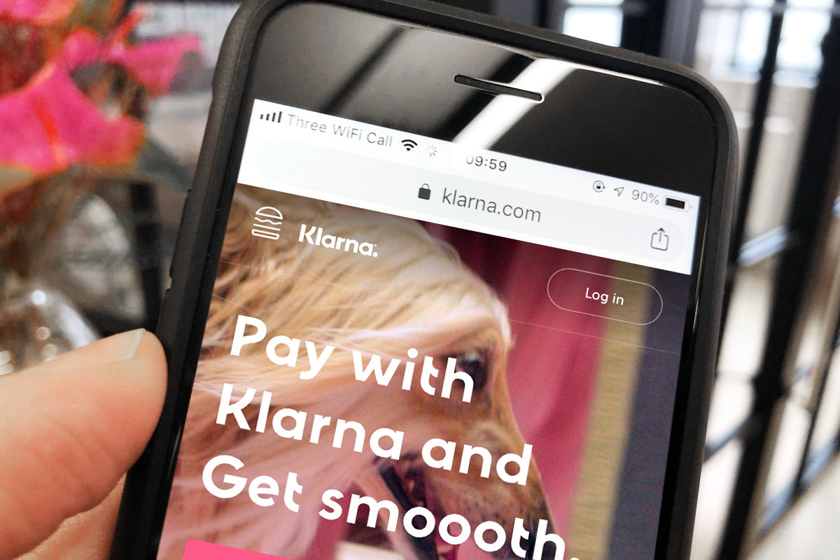
Klarna is a business that’s built on a brilliant idea: shop online with a merchant which uses Klarna and you can pay later and in instalments if you like. It’s ideal if you’re the kind of shopper that orders a lot of stuff and sends most of it back. Klarna adjusts your balance when items are returned so you only pay for what you keep.
Some founders might have decided all they needed to launch this business was a super-functional transactional app. Klarna had the ambition to go beyond this to create an unforgettable brand experience based on the promise of making life, not just shopping, smoother.
Love is in the details
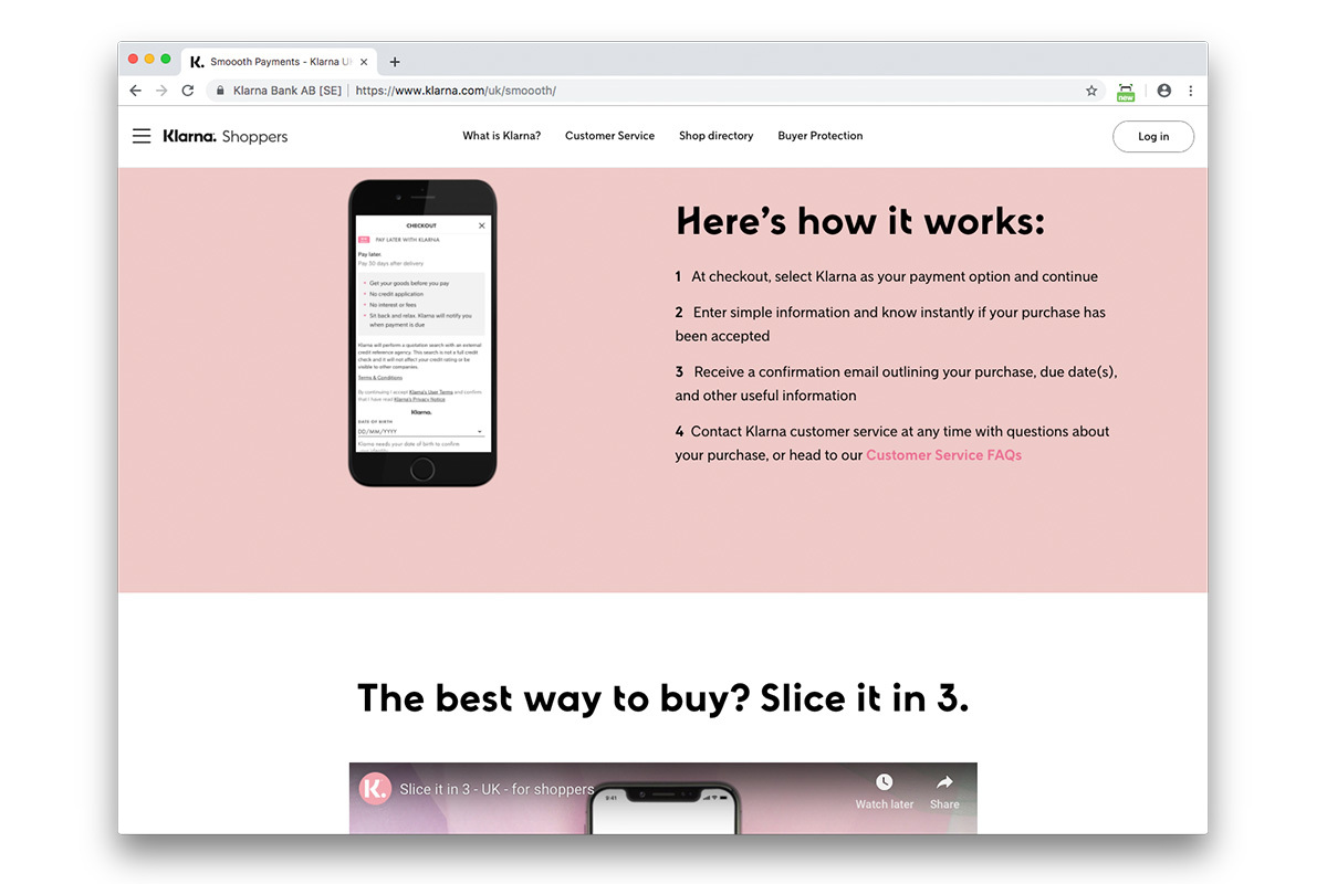
Klarna feels more like a lifestyle brand than a payments solution because that promise is expressed through cool imagery, witty copy, a palette of soft colours and flowing type that adds texture to the smooth animations and interactions expected from any decent app.
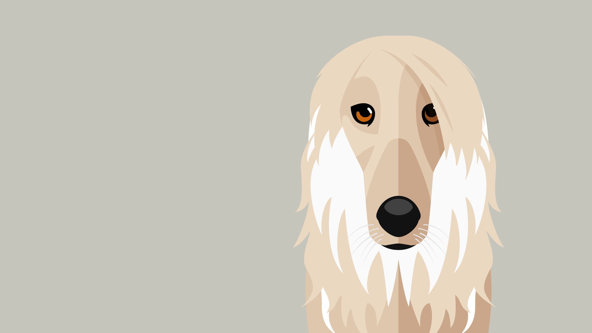
Klarna goes all-in on the smooth concept with brand ambassadors like Snoop Dogg plus actual dogs. Also cute details like the animated hamburger menu, which would not be included in a user experience brief but makes Klarna even more lovable.
Get the best from both
Hats off to Klarna for this lesson on how to make user experience and brand work together. This isn’t always straightforward. The best UX solution may not always fit the brand, and vice-versa. Our advice to startups is to give equal attention to both from the beginning and work on them together every step of the way.